JUNE BANG
Motion Designer + Illustrator
The True Cost of All
As a lead motion designer of True Cost, an original series at Insider, I had the opportunity to give the show a complete graphic facelift. The team requested to have graphics that are more multifaceted design system that suits the dark, investigative tone of the show narrative. They also wanted to keep some of the elements of their original graphic branding to keep all of their episodes visually connected.

True Cost styleguide
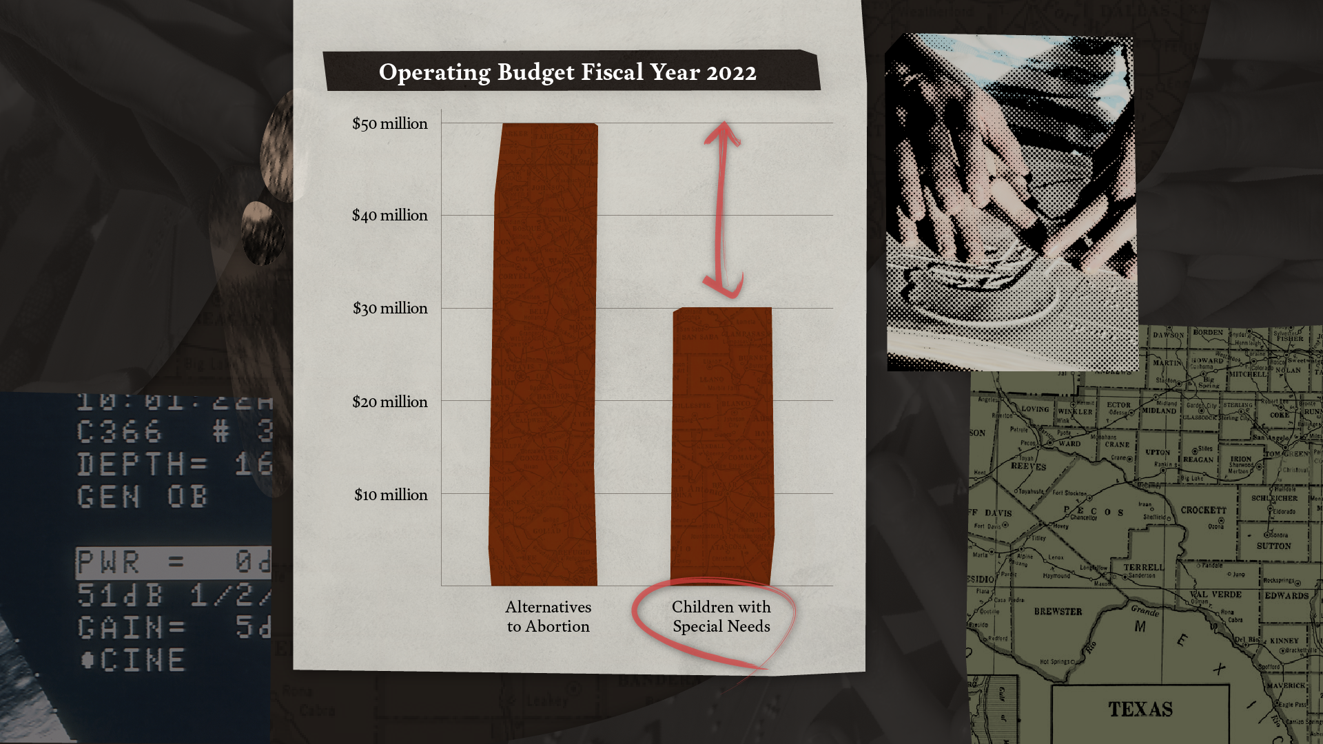
The inspiration for the rebrand is heavily based on retro journalism media layouts along with contemporary minimal collage artworks. The new design system can show case as many images and b-rolls as needed and leads the viewer’s eyes through camera panning. It reflects the narrative style of True Cost which presents various informations that lead to the final reveal.
The strongest characteristic of the original branding was highlighting informations through red circles and its use is now expanded even further not only in a circle, but also as lines, various shapes, highlighter, and more.